Typography is more than choosing a pretty font—it’s the art of arranging text so it’s not only readable but also visually engaging. In graphic design, typography sets the tone, guides the viewer’s eye, and strengthens brand identity. Let’s explore the best practices for using typography effectively.
1. Understand Typeface Categories
Serif fonts – Traditional, elegant, and authoritative (e.g., Times New Roman).
Sans-serif fonts – Clean, modern, and minimal (e.g., Helvetica, Arial).
Script fonts – Decorative, expressive, and formal (e.g., wedding invitations).
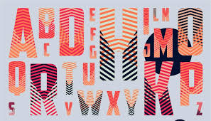
Display fonts – Bold, unique, for headlines only (e.g., posters, ads).
👉 Rule: Match the typeface with the project’s purpose and personality.
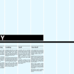
2. Prioritize Readability
No matter how stylish, text must be easy to read. Consider:
Adequate font size (14–16px for body text online).
Sufficient line spacing (leading) for breathing room.
Clear contrast between text and background.
3. Limit Font Choices
Too many fonts create chaos. Stick to two or three maximum:
One for headings.
One for body text.
Optional accent font for emphasis.
4. Create Visual Hierarchy
Hierarchy directs the reader’s attention. Use:
Size (big headlines, smaller subtext).
Weight (bold vs. regular).
Color (contrasting tones for emphasis).
👉 Example: A poster headline might be huge and bold, while event details are smaller and lighter.
5. Pair Fonts Wisely
Font pairing is an art. Some proven combinations:
Serif + Sans-serif (classic contrast).
Bold Display + Clean Sans-serif (modern).
Monospace + Minimal Sans (techy vibe).
👉 Tools like Google Fonts Pairing can help find balanced matches.
6. Use Alignment for Order
Aligning text creates structure. Options:
Left-aligned – Most readable for body copy.
Centered – Best for titles or invitations.
Justified – Clean look but watch for uneven spacing.
7. Pay Attention to Kerning and Tracking
Kerning – Space between individual letters.
Tracking – Space across a whole word or sentence.
Tight or loose spacing can dramatically change the feel of text.
8. Consider Brand Personality
Typography should reinforce the brand identity:
A law firm may use serif fonts for authority.
A tech startup may use sans-serif for modernity.
A children’s brand may use rounded or playful fonts.
9. Don’t Forget Accessibility
Typography should be inclusive. Avoid overly decorative fonts for body text and ensure good legibility for users with visual impairments.
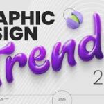
10. Stay Updated with Trends
In 2025, popular typography trends include:
Kinetic typography (animated text).
Variable fonts (flexible weight/width).
Bold experimental display fonts for brand headlines.
Conclusion
Typography is the backbone of graphic design. By mastering readability, hierarchy, alignment, and pairing, designers can create text that doesn’t just communicate words—it expresses emotion and identity. Good typography makes design memorable, professional, and impactful.