Balancing Aesthetics and Usability

Designers often face a common challenge: should they prioritize visual appeal or functionality? A beautiful interface that’s hard to use frustrates users, while a purely functional design with no aesthetic value feels dull and uninspiring. The real skill in UI/UX design lies in balancing aesthetics and usability to create experiences that are both attractive and effective.


1. Why Aesthetics Matter

  • First Impressions – Users form opinions about a product in seconds, and visuals play a big role.

  • Emotional Connection – A pleasing design creates trust and delight.

  • Brand Identity – Consistent aesthetics reinforce recognition and credibility.


2. Why Usability Matters

  • Task Completion – Users must achieve their goals without confusion.

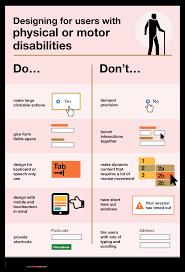
  • Accessibility – Functionality ensures inclusivity for all users.

  • Retention – A product that’s easy to use keeps people coming back.


3. The Aesthetic-Usability Effect

Research shows that users perceive attractive designs as easier to use—even when usability issues exist. While aesthetics can boost perceived usability, poor functionality eventually drives users away.

👉 Example: A beautifully designed checkout page that confuses users will still result in abandoned carts.


4. Strategies to Balance Both

Prioritize Clarity

Aesthetic choices should never compromise readability or navigation.

Use Visual Hierarchy

Typography, color, and spacing can highlight key actions without overwhelming the user.

Keep It Simple

Minimalism often enhances both beauty and usability by reducing clutter.

Test with Real Users

Usability testing reveals whether visuals enhance or hinder task completion.

Align with Brand and Context

Playful animations may suit an entertainment app but not a banking platform.


5. Best Practices

  • Readable Typography – Choose fonts that look good and are easy to read.

  • Consistent Colors – Ensure brand consistency while maintaining contrast for accessibility.

  • Meaningful Animations – Use transitions that guide users, not distract them.

  • Responsive Design – Aesthetic integrity should be preserved across devices.


6. Examples of Balance

  • Apple – Sleek, minimalist designs that remain highly functional.

  • Google Maps – Clean visuals paired with powerful usability.

  • Airbnb – Aesthetic imagery enhances trust while navigation remains simple.


Conclusion

Aesthetics and usability are not opposing forces—they complement each other. Successful design blends visual appeal with functionality, ensuring users feel both delighted and empowered. The best products are not just usable or beautiful—they are both.

User-Centered Design Principles

Great products are built around users, not just technology or business goals. User-Centered Design (UCD) is a design philosophy that prioritizes the needs, behaviors, and goals of real people at every stage of product development. By focusing on users, designers create solutions that are both functional and enjoyable.


1. What Is User-Centered Design?

User-Centered Design is an iterative process where designers involve users throughout planning, design, and testing. Instead of assuming what users want, teams actively gather feedback and refine products based on real-world insights.


2. Why UCD Matters

  • Better Usability – Products become easier to use.

  • Higher Satisfaction – Designs align with user goals and reduce frustration.

  • Increased Adoption – People are more likely to embrace intuitive products.

  • Reduced Costs – Catching issues early prevents expensive redesigns.


3. Core Principles of UCD

1. Focus on Users from the Start

Understand who your users are, their goals, and the problems they face.

2. Involve Users Throughout the Process

Conduct surveys, interviews, and usability testing regularly—not just once.

3. Iterative Design

Design, test, and refine in cycles until the product meets user needs effectively.

4. Clear Requirements

Translate user research into design requirements that guide the project.

5. Holistic Experience

Consider the entire user journey, not just isolated screens or tasks.


4. UCD Process

  1. Research – Identify user needs via interviews, surveys, and observation.

  2. Define – Turn findings into personas, user stories, and requirements.

  3. Design – Create wireframes, prototypes, and user flows.

  4. Evaluate – Test prototypes with real users and adjust designs.

  5. Iterate – Refine continuously until the design works seamlessly.


5. Tools for User-Centered Design

  • Figma / Sketch – Collaborative prototyping.

  • Miro – Mapping user journeys.

  • UserTesting / Maze – Running usability tests.

  • Personas & Empathy Maps – Summarize user needs and motivations.


6. Examples of UCD in Action

  • Google Search – Minimal design focused on a single user task: finding information quickly.

  • Spotify – Personalized playlists built around user preferences.

  • Duolingo – Gamified learning experience shaped by user engagement studies.


7. Challenges of UCD

  • Time-Consuming – Research and testing require resources.

  • Conflicting Needs – Different users may want different things.

  • Stakeholder Resistance – Business goals sometimes overshadow user priorities.


Conclusion

User-Centered Design is about empathy, iteration, and collaboration. By placing users at the heart of design decisions, businesses build products that people not only use—but love. UCD isn’t just a methodology, it’s a mindset that ensures technology serves humans, not the other way around.

Designing for Accessibility

Accessibility in design is about creating digital products that can be used by everyone, including people with disabilities. A website or app that isn’t accessible excludes millions of users and can even violate legal requirements in many countries. More importantly, accessible design improves the experience for all users.


1. What Is Accessibility in UX?

Accessibility means removing barriers so people with visual, auditory, motor, or cognitive impairments can use digital products effectively.

👉 Example: Adding alt text to images ensures screen readers can describe them to visually impaired users.


2. Why Accessibility Matters

  • Inclusivity – Everyone deserves equal access to information and services.

  • Legal Compliance – Many regions enforce standards like WCAG (Web Content Accessibility Guidelines) or ADA.

  • Business Benefits – Accessible websites reach a wider audience and improve brand reputation.

  • Better UX for All – Features like captions and high contrast help everyone, not just people with disabilities.


3. Key Principles of Accessible Design (WCAG Guidelines)

  1. Perceivable – Content must be presented in ways users can perceive (e.g., text alternatives for images).

  2. Operable – Interfaces should be usable via keyboard, voice, or other assistive technologies.

  3. Understandable – Information and navigation must be clear and predictable.

  4. Robust – Content should work across different devices, browsers, and assistive tools.


4. Practical Accessibility Practices

  • Alt Text for Images – Describe visuals for screen readers.

  • Color Contrast – Ensure text is readable against backgrounds (minimum ratio 4.5:1).

  • Keyboard Navigation – All functions should work without a mouse.

  • Readable Typography – Use clear fonts, adequate size, and sufficient spacing.

  • Captions & Transcripts – Provide for videos and audio content.

  • Error Messages – Clear instructions help users correct mistakes.


5. Tools for Testing Accessibility

  • WAVE – Evaluates website accessibility.

  • axe DevTools – Chrome extension for WCAG checks.

  • NVDA / JAWS – Screen readers to simulate visually impaired experiences.

  • Color Oracle – Simulates different types of color blindness.


6. Examples of Good Accessibility

  • YouTube – Auto-captions make videos more inclusive.

  • BBC – High-contrast mode and screen reader-friendly layouts.

  • Apple – Built-in accessibility features like VoiceOver and assistive touch.


7. Common Mistakes to Avoid

  • Relying on color alone to convey meaning (e.g., red = error).

  • Using small fonts or poor spacing.

  • Forgetting about mobile accessibility.

  • Ignoring captions for multimedia.


Conclusion

Designing for accessibility is not just about compliance—it’s about empathy. By making products perceivable, operable, understandable, and robust, designers create inclusive experiences that benefit everyone. Accessibility should be a default part of design, not an afterthought.

Microinteractions and Their Impact on UX

Sometimes, it’s the smallest details that make the biggest difference. In UI/UX design, microinteractions are those subtle animations or responses that happen when a user performs a small action—like pressing a button, toggling a switch, or receiving a notification. Though small, they have a huge impact on how users perceive and interact with digital products.


1. What Are Microinteractions?

Microinteractions are short, functional design responses that provide feedback to the user.

👉 Examples:

  • A heart icon filling in red when you “like” a post.

  • A vibration or chime when a message is sent.

  • A progress bar showing file upload status.

They’re not just decorative; they enhance usability by making actions clearer.


2. Why Microinteractions Matter

  • Feedback – Show users that their action worked.

  • Engagement – Small delights keep users emotionally connected.

  • Error Prevention – Subtle warnings (e.g., shaking password fields) help users correct mistakes quickly.

  • Intuitiveness – Make interfaces feel natural, almost human-like.


3. Core Elements of Microinteractions

  1. Trigger – The action that starts it (tap, click, hover).

  2. Rules – Define what happens in response.

  3. Feedback – Visual, audio, or haptic cues that confirm the result.

  4. Loop & Modes – Determine if the interaction repeats or changes based on conditions.


4. Common Types of Microinteractions

  • Button Animations – Buttons that change color or size when tapped.

  • Loading Indicators – Spinners, skeleton screens, or playful animations.

  • Toggles and Switches – Smooth transitions between states (on/off).

  • Form Feedback – Real-time validation for emails, passwords, etc.

  • Notifications – Subtle alerts without overwhelming the user.


5. Best Practices

  • Keep It Subtle – Microinteractions should enhance, not distract.

  • Align With Brand Personality – Playful animations work for fun apps, but not for banking tools.

  • Prioritize Function – Always serve a purpose, like confirming or guiding actions.

  • Ensure Performance – Animations must be smooth, not laggy.

  • Test for Accessibility – Provide alternatives for users with visual or hearing impairments.


6. Tools for Designing Microinteractions

  • Figma / ProtoPie – For prototyping simple animations.

  • After Effects + Lottie – Export lightweight, scalable animations for apps.

  • Framer Motion – Great for React-based microinteraction design.


7. Examples of Effective Microinteractions

  • Twitter – The animated heart when liking a tweet feels rewarding.

  • Dropbox – Fun illustrations on loading screens ease waiting time.

  • Slack – Custom notification sounds create personality and clarity.


Conclusion

Microinteractions may seem small, but they can dramatically improve user experience. They provide clarity, add delight, and make digital products feel alive. In great design, it’s often the little things that users remember most.

Designing Intuitive Navigation

Navigation is the backbone of any digital product. If users can’t find what they’re looking for, they’ll leave—no matter how beautiful the design is. That’s why intuitive navigation is one of the most important aspects of UI/UX design. It ensures users move smoothly through a website or app without confusion.


1. Why Navigation Matters

  • Reduces Friction – Clear navigation minimizes frustration.

  • Improves Engagement – Users stay longer when they can explore easily.

  • Boosts Conversions – Easy access to key pages (e.g., checkout, contact) increases success rates.

  • Supports SEO – Well-structured navigation helps search engines understand content hierarchy.


2. Principles of Intuitive Navigation

Simplicity

Keep menus short and focused. Overloading users with too many options leads to decision fatigue.

Consistency

Navigation should look and behave the same across pages and devices. Users rely on predictability.

Visibility

Navigation elements must be easy to spot. Hidden or overly creative menus can confuse users.

Hierarchy

Organize items logically, grouping related content together. Use categories and subcategories when necessary.

Feedback

Highlight the current page or section so users know where they are.


3. Common Navigation Patterns

  • Top Navigation Bar – Most common on desktops.

  • Hamburger Menu – Popular in mobile apps, collapses content into an icon.

  • Sidebar Navigation – Useful for apps with many sections, like dashboards.

  • Sticky Navigation – Stays visible while scrolling for quick access.

  • Breadcrumbs – Show the user’s location in multi-level hierarchies.


4. Mobile Navigation Considerations

  • Use clear icons with text labels (not just symbols).

  • Make touch targets large enough for fingers.

  • Avoid deep nesting—too many layers make navigation frustrating.


5. Best Practices

  • Use Familiar Labels – “Home,” “About,” “Contact” work better than clever but vague terms.

  • Prioritize Important Pages – Place high-value actions (Shop, Sign Up, Cart) prominently.

  • Limit Depth – Keep navigation levels shallow; users shouldn’t click more than 2–3 times to find content.

  • Test with Real Users – What feels obvious to designers may confuse others.


6. Tools for Designing Navigation

  • Figma / Sketch – For wireframing navigation flows.

  • Card Sorting (via tools like OptimalSort) – Helps structure menus based on how users naturally categorize information.

  • Heatmaps (Hotjar, Crazy Egg) – Show how users interact with navigation elements.


7. Examples of Great Navigation

  • Amazon – Complex product catalog simplified with mega-menus and filters.

  • Spotify – Simple sidebar navigation keeps music browsing intuitive.

  • Apple – Clean, consistent top navigation with minimal but clear options.


Conclusion

Designing intuitive navigation means putting users first. By keeping menus simple, consistent, and well-organized, designers create digital experiences that feel natural and effortless. Great navigation is invisible—it simply works, letting users focus on their goals instead of figuring out how to get there.

Mobile-First Design: Why It Matters

More than half of global web traffic now comes from smartphones. For many users, the mobile screen is their primary gateway to the internet. This shift has made mobile-first design a critical principle in UI/UX. Instead of designing for desktop first and shrinking it down, mobile-first starts with the smallest screen and scales up.


1. What Is Mobile-First Design?

Mobile-first design is a strategy where the mobile experience is prioritized during the design process. The idea is simple: design for the most constrained environment first, then add complexity as screen space increases.

👉 Example: A website’s core features (like search, product pages, checkout) are designed to work seamlessly on mobile before expanding into richer desktop layouts.


2. Why Mobile-First Matters

  • User Behavior – People spend more time browsing and shopping on their phones than desktops.

  • Performance – Mobile-first ensures lightweight, fast-loading pages.

  • SEO Advantage – Google uses mobile-first indexing, meaning it ranks sites based on their mobile version.

  • Accessibility – Prioritizing mobile often improves usability for all devices.


3. Core Principles of Mobile-First Design

Prioritize Content

Show the most important features first. Secondary elements can appear lower or be hidden behind menus.

Simplify Navigation

Mobile screens have limited space. Use clear icons, collapsible menus, and intuitive gestures.

Optimize Touch Interactions

Buttons and links must be large enough for fingers, with enough spacing to avoid accidental clicks.

Load Fast

Mobile users expect quick access. Compress images, minimize code, and use lazy loading where possible.

Progressive Enhancement

Start with mobile basics, then enhance layouts with larger screens (e.g., sidebars, animations, extra visuals).


4. Benefits for Users and Businesses

  • Better UX – A smooth mobile experience increases engagement.

  • Higher Conversions – Mobile-friendly checkouts reduce cart abandonment.

  • Broader Reach – Works well in regions where mobile is the primary device.

  • Future-Proofing – Ensures compatibility with wearables and smaller screens.


5. Challenges of Mobile-First

  • Content Limitations – Not everything fits on a small screen; prioritization is critical.

  • Complex Workflows – Some advanced features may need creative simplification.

  • Testing – Must be tested across many devices and operating systems.


6. Examples of Mobile-First Success

  • Instagram – Built for mobile first, with desktop added later.

  • Airbnb – Mobile-friendly booking process increases trust and usability.

  • Google Maps – Designed for mobile use, with location-first functionality.


Conclusion

Mobile-first design isn’t just a trend—it’s a necessity in today’s digital world. By prioritizing performance, content, and usability on small screens, designers create experiences that feel seamless everywhere. For businesses, adopting mobile-first is no longer optional if they want to stay competitive.

The Importance of Responsive Design

Today’s users browse websites and apps on a wide variety of devices—desktops, laptops, tablets, and smartphones of all shapes and sizes. A design that looks perfect on one screen may appear broken or unreadable on another. That’s why responsive design is no longer optional—it’s essential for modern UX.


1. What Is Responsive Design?

Responsive design is an approach where layouts automatically adjust to different screen sizes and orientations. Instead of building separate designs for each device, one flexible design adapts to all.

👉 Example: A website’s three-column desktop layout may collapse into a single column on mobile.


2. Why Responsive Design Matters

  • Improved User Experience – Users can browse comfortably without zooming or scrolling awkwardly.

  • Accessibility – Makes content available to users on any device.

  • SEO Benefits – Google prioritizes mobile-friendly sites in search rankings.

  • Cost-Effective – One responsive design replaces the need for multiple versions.


3. Key Principles of Responsive Design

Flexible Layouts

Use relative units (percentages, ems) instead of fixed pixels to ensure elements scale naturally.

Fluid Grids

Adopt grid systems (like 12-column grids) that adjust across breakpoints for consistency.

Breakpoints

Define screen widths where layout changes occur (e.g., 320px for mobile, 768px for tablets, 1200px for desktops).

Flexible Images and Media

Images should scale with layouts or switch to smaller versions on mobile to save bandwidth.

Mobile-First Approach

Start designing for the smallest screen, then expand for larger devices. This ensures core functionality is never lost.


4. Challenges of Responsive Design

  • Performance – Large images and heavy content may still slow down mobile experiences.

  • Complex Testing – Designers must test across many devices and browsers.

  • Content Prioritization – Not all content fits small screens; designers must decide what’s essential.


5. Best Practices

  • Use Scalable Typography – Relative font sizes ensure readability everywhere.

  • Simplify Navigation – Mobile menus should be intuitive, often with collapsible options.

  • Test on Real Devices – Simulators help, but real-world testing is critical.

  • Design for Touch – Buttons and links must be large enough for fingers, not just cursors.


6. Responsive vs. Adaptive Design

  • Responsive – One fluid design that adapts across all screens.

  • Adaptive – Multiple fixed layouts designed for specific devices.

👉 Responsive is more flexible, while adaptive may offer more control.


Conclusion

Responsive design ensures that users enjoy a seamless experience no matter what device they use. It boosts accessibility, improves SEO, and builds trust with audiences who expect digital products to “just work.” In today’s multi-device world, responsive design is not just important—it’s a necessity.

How to Conduct Usability Testing

Great design isn’t just about how something looks—it’s about how well it works for real users. That’s where usability testing comes in. It’s the process of observing people as they interact with your product to identify problems and opportunities for improvement. Here’s a step-by-step guide to conducting effective usability testing.


1. What Is Usability Testing?

Usability testing evaluates how easy and intuitive a product is by asking users to complete specific tasks. Unlike focus groups, which gather opinions, usability tests reveal actual behaviors and challenges.

👉 Example: Asking users to sign up for a new account and observing where they struggle.


2. Why It Matters

  • Uncovers Pain Points – Shows where users get confused or stuck.

  • Validates Design Decisions – Confirms whether layouts and features work as intended.

  • Saves Time & Money – Fixing issues early prevents expensive redesigns later.

  • Improves User Satisfaction – A smoother experience builds loyalty and trust.


3. Steps to Conduct Usability Testing

Step 1: Define Goals

Decide what you want to test. Examples:

  • Can users complete checkout smoothly?

  • Do they understand the navigation menu?

  • Is the onboarding process clear?

Step 2: Recruit Participants

Find users who match your target audience. Around 5–7 participants is usually enough to uncover 80% of issues.

Step 3: Prepare Tasks

Create realistic scenarios, such as:

  • “Find a black T-shirt in size M and add it to your cart.”

  • “Book a hotel room for two nights in New York.”

Step 4: Choose Testing Method

  • In-person testing – Observe body language and facial expressions.

  • Remote testing – Participants share screens and complete tasks online.

Step 5: Observe, Don’t Interfere

Encourage users to think aloud as they work. Resist the urge to help them—frustrations reveal important insights.

Step 6: Record and Analyze

Take notes, record sessions, and categorize issues by severity: critical, moderate, or minor.


4. Best Practices

  • Keep tests short (30–60 minutes).

  • Use neutral language—avoid leading participants.

  • Test iteratively after each design update.

  • Combine qualitative feedback (observations) with quantitative data (completion time, error rates).


5. Common Mistakes to Avoid

  • Testing with the wrong audience.

  • Asking users for opinions instead of watching behaviors.

  • Running only one test and assuming the work is done.


6. Tools for Usability Testing

  • Lookback – Records user sessions with commentary.

  • Maze – Remote usability and prototype testing.

  • UserTesting – Provides participant recruitment and testing platform.

  • Figma prototypes – Simple for quick testing.


Conclusion

Usability testing is the most effective way to see your design through your users’ eyes. By setting clear goals, observing real behavior, and iterating based on findings, you can build products that are not just functional but delightful to use.

The Role of Wireframing in UX Design

Before designers jump into polished mockups and interactive prototypes, they often start with wireframes. Wireframing is a critical step in UX design because it focuses on structure and functionality without distractions from colors, typography, or images. Here’s why wireframing is so important and how to use it effectively.


1. What Is a Wireframe?

A wireframe is a simplified blueprint of a digital product. It shows the layout of elements on a page—such as headers, buttons, menus, and content blocks—without detailed styling.

👉 Think of it as the architectural floor plan of a house before interior decoration.


2. Why Wireframes Matter

  • Clarify Ideas – They help teams visualize concepts quickly.

  • Save Time and Money – Easy to adjust before investing in high-fidelity design or coding.

  • Improve Collaboration – Designers, developers, and stakeholders can align on structure early.

  • Focus on Functionality – Keeps attention on usability rather than aesthetics.


3. Types of Wireframes

  1. Low-Fidelity Wireframes

    • Simple sketches or digital outlines.

    • Useful for brainstorming and early discussions.

  2. Mid-Fidelity Wireframes

    • More detail, often including basic text and content placement.

    • Show clearer hierarchy and flow.

  3. High-Fidelity Wireframes

    • Close to final design, sometimes interactive.

    • Used for usability testing and stakeholder approval.


4. Tools for Wireframing

  • Sketching on Paper – Fast and flexible.

  • Figma / Sketch / Adobe XD – Digital wireframing tools with collaboration features.

  • Balsamiq – Popular for low-fidelity wireframes with a hand-drawn feel.


5. Best Practices for Wireframing

  • Keep It Simple – Use gray boxes, placeholders, and basic lines.

  • Focus on Layout & Flow – Show how users move from one screen to another.

  • Use Realistic Content When Possible – Avoid too many “Lorem Ipsum” fillers.

  • Iterate Quickly – Wireframes are meant to be changed often.


6. Wireframing for Teams

Wireframes help bridge the gap between:

  • Designers – who visualize structure.

  • Developers – who need clarity on functionality.

  • Stakeholders – who care about business goals.

They ensure everyone is aligned before costly design and development work begins.


7. From Wireframes to Prototypes

Wireframes often evolve into interactive prototypes, adding colors, branding, and interactions. Starting with wireframes ensures the foundation is solid before moving into detail.


Conclusion

Wireframing is an essential step in UX design. It allows teams to focus on structure, user flow, and functionality before diving into aesthetics. By using wireframes, designers reduce risks, save resources, and create products that are both functional and user-friendly.

Principles of Great User Experience (UX)

User Experience (UX) is more than just a buzzword—it’s the foundation of every successful digital product. Whether you’re designing a website, mobile app, or software, great UX ensures users can achieve their goals efficiently while enjoying the process. Here are the core principles that define excellent UX design.


1. User-Centered Design

The golden rule of UX: design for the user, not for yourself. Every decision should be based on the user’s needs, goals, and behaviors. User research, surveys, and usability testing help uncover what real users actually want.


2. Clarity and Simplicity

Good UX eliminates confusion. Clear navigation, simple layouts, and intuitive labels ensure users know what to do next without second-guessing. If users have to “figure it out,” the design has failed.

👉 Example: Google’s homepage—just a search bar and logo.


3. Consistency

Consistency across typography, buttons, colors, and icons builds familiarity. Users shouldn’t need to relearn how things work on each page. Consistency creates trust and speeds up navigation.


4. Feedback and Responsiveness

Users need confirmation that their actions worked. For example:

  • A button changes color when clicked.

  • A loading spinner shows progress.

  • An error message explains what went wrong.

Feedback reduces frustration and builds confidence.


5. Accessibility

Great UX works for everyone, including people with disabilities. This means:

  • High color contrast for readability.

  • Text alternatives for images.

  • Keyboard navigation support.

Accessibility isn’t optional—it’s essential.


6. Efficiency

Users value time. Streamlined workflows, shortcuts, and predictive text make interactions faster. The fewer steps required to complete a task, the better the UX.


7. Flexibility

A good design adapts to different users and devices. Responsive layouts ensure usability across desktops, tablets, and smartphones. Advanced users might appreciate shortcuts, while beginners need guided experiences.


8. Error Prevention & Recovery

No design is perfect, and users will make mistakes. Great UX prevents errors with clear instructions, but also provides easy recovery:

  • Undo buttons

  • Clear error messages

  • Autosave features


9. Emotional Design

Beyond functionality, UX should create positive emotions. Delightful animations, playful micro-interactions, or friendly copywriting can make users smile and build loyalty.


10. Continuous Improvement

UX doesn’t end at launch. Ongoing testing, analytics, and feedback help refine the experience over time. The best products evolve with their users.


Conclusion

Great UX is about creating products that are useful, usable, and enjoyable. By focusing on clarity, consistency, accessibility, and emotional engagement, designers can build experiences that not only solve problems but also leave a lasting positive impression.