In graphic design, many beginners make the mistake of filling every inch of a layout with text, images, or colors. But sometimes, what you leave out is just as important as what you include. This is where white space, also known as negative space, comes in. Far from being “empty,” white space is a powerful tool that brings clarity, elegance, and focus to a design.
1. What Is White Space?
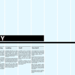
White space refers to the areas of a design that are left unmarked—the gaps between text, images, and other elements. It doesn’t have to be white; it can be any background color, texture, or pattern.
👉 Example: Google’s homepage uses abundant white space to highlight the search bar.
2. Why White Space Matters
Improves Readability – Adequate spacing between lines and paragraphs makes text easier to read.
Creates Focus – By reducing clutter, white space directs the viewer’s eye to the most important content.
Adds Elegance – Luxury brands often use white space to convey sophistication and minimalism.
Balances Layouts – Prevents designs from looking overwhelming or chaotic.
3. Types of White Space
Micro White Space – Small gaps like line spacing, letter spacing (kerning), or margins around buttons.
Macro White Space – Larger empty areas, such as margins around an entire layout or space between major sections.
Both types are essential for structure and visual flow.
4. White Space in Typography
Good typography relies on spacing:
Adequate leading makes long text blocks more digestible.
Proper kerning ensures letters don’t appear cramped or disconnected.
Margins around text blocks prevent a “wall of text” effect.
5. White Space in Branding
Brands like Apple and Chanel use generous white space in advertising to highlight their products. The empty areas make the product the hero, creating a sense of exclusivity and luxury.
6. White Space in Digital Design
In web and app design, white space improves user experience by:
Making navigation intuitive.
Highlighting CTAs (call-to-action buttons).
Giving breathing room on mobile screens.
👉 Example: Airbnb’s app uses clear spacing to guide users smoothly through booking steps.
7. Avoiding Common Mistakes
Too little white space → Cluttered, overwhelming, hard to read.
Too much white space → Risk of looking empty or unfinished.
Inconsistent spacing → Breaks visual flow and looks unprofessional.
8. White Space as Active Design
Remember: white space isn’t passive. It creates rhythm, hierarchy, and emphasis. Think of it as the pause in music that makes the notes more powerful.
Conclusion
White space is not wasted space—it’s a critical element of graphic design. By using it wisely, you can create designs that are clean, readable, and elegant. Whether in branding, web design, or print, mastering white space is one of the most effective ways to elevate your work from amateur to professional.