Today’s users browse websites and apps on a wide variety of devices—desktops, laptops, tablets, and smartphones of all shapes and sizes. A design that looks perfect on one screen may appear broken or unreadable on another. That’s why responsive design is no longer optional—it’s essential for modern UX.
1. What Is Responsive Design?
Responsive design is an approach where layouts automatically adjust to different screen sizes and orientations. Instead of building separate designs for each device, one flexible design adapts to all.
👉 Example: A website’s three-column desktop layout may collapse into a single column on mobile.
2. Why Responsive Design Matters
Improved User Experience – Users can browse comfortably without zooming or scrolling awkwardly.
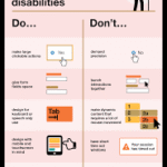
Accessibility – Makes content available to users on any device.
SEO Benefits – Google prioritizes mobile-friendly sites in search rankings.
Cost-Effective – One responsive design replaces the need for multiple versions.
3. Key Principles of Responsive Design
Flexible Layouts
Use relative units (percentages, ems) instead of fixed pixels to ensure elements scale naturally.
Fluid Grids
Adopt grid systems (like 12-column grids) that adjust across breakpoints for consistency.
Breakpoints
Define screen widths where layout changes occur (e.g., 320px for mobile, 768px for tablets, 1200px for desktops).
Flexible Images and Media
Images should scale with layouts or switch to smaller versions on mobile to save bandwidth.
Mobile-First Approach
Start designing for the smallest screen, then expand for larger devices. This ensures core functionality is never lost.
4. Challenges of Responsive Design
Performance – Large images and heavy content may still slow down mobile experiences.
Complex Testing – Designers must test across many devices and browsers.
Content Prioritization – Not all content fits small screens; designers must decide what’s essential.
5. Best Practices
Use Scalable Typography – Relative font sizes ensure readability everywhere.
Simplify Navigation – Mobile menus should be intuitive, often with collapsible options.
Test on Real Devices – Simulators help, but real-world testing is critical.
Design for Touch – Buttons and links must be large enough for fingers, not just cursors.
6. Responsive vs. Adaptive Design
Responsive – One fluid design that adapts across all screens.
Adaptive – Multiple fixed layouts designed for specific devices.
👉 Responsive is more flexible, while adaptive may offer more control.
Conclusion
Responsive design ensures that users enjoy a seamless experience no matter what device they use. It boosts accessibility, improves SEO, and builds trust with audiences who expect digital products to “just work.” In today’s multi-device world, responsive design is not just important—it’s a necessity.