Graphic design is everywhere—logos, posters, websites, packaging, even social media posts. But behind every beautiful design lies a set of core principles. Whether you’re starting as a beginner or refreshing your basics, understanding these fundamentals is key to creating work that is both aesthetically pleasing and functional.
1. Balance
Balance ensures that elements in a design feel evenly distributed. It comes in two main forms:
Symmetrical balance – Equal weight on both sides (formal, traditional).
Asymmetrical balance – Unequal but visually harmonious (dynamic, modern).
👉 Good balance prevents designs from looking cluttered or chaotic.
2. Contrast
Contrast makes certain elements stand out. It can be achieved through differences in:
Color (light vs. dark)
Size (large vs. small)
Typeface (bold vs. thin)
Shape (organic vs. geometric)
👉 Without contrast, designs look flat and fail to grab attention.
3. Hierarchy
Hierarchy guides the viewer’s eye to the most important information first. Designers use:
Font size
Boldness
Placement
Color emphasis
👉 Example: A poster headline is large and bold, while details like date and location are smaller.
4. Alignment
Alignment creates order and connection between elements. Misaligned text or graphics can feel messy. Using a grid system helps maintain clean layouts.
5. Repetition
Repetition builds consistency. Using the same colors, fonts, or shapes throughout a project reinforces brand identity and creates visual harmony.
6. Proximity
Proximity means grouping related items together. For example, placing a product name, price, and description close to each other makes it easier to understand.
7. Color Theory Basics
Colors influence mood and perception.
Warm colors (red, orange, yellow) feel energetic.
Cool colors (blue, green, purple) feel calm.
Complementary colors create contrast.
Analogous colors feel harmonious.
👉 A strong grasp of color psychology makes designs more effective.
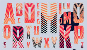
8. Typography Essentials
Fonts convey personality. Serif fonts feel traditional, sans-serif fonts modern, and script fonts elegant. Pairing fonts wisely improves readability and style.
9. White Space
Also known as negative space, white space is the empty area around design elements. Far from being wasted space, it gives designs breathing room and elegance.
10. Function Over Decoration
The most important rule: design isn’t just about looking pretty. Every element must serve a purpose—whether it’s improving readability, emphasizing a message, or guiding user behavior.
Conclusion
By mastering these graphic design fundamentals—balance, contrast, hierarchy, alignment, repetition, proximity, color, typography, and white space—you’ll create designs that are both beautiful and effective. These principles form the foundation for everything from logos to complex layouts, and they remain timeless no matter how trends evolve.