Accessibility in design is about creating digital products that can be used by everyone, including people with disabilities. A website or app that isn’t accessible excludes millions of users and can even violate legal requirements in many countries. More importantly, accessible design improves the experience for all users.
1. What Is Accessibility in UX?
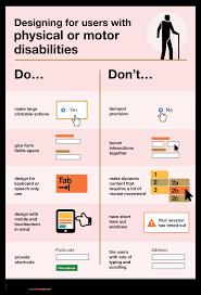
Accessibility means removing barriers so people with visual, auditory, motor, or cognitive impairments can use digital products effectively.
👉 Example: Adding alt text to images ensures screen readers can describe them to visually impaired users.
2. Why Accessibility Matters
Inclusivity – Everyone deserves equal access to information and services.
Legal Compliance – Many regions enforce standards like WCAG (Web Content Accessibility Guidelines) or ADA.
Business Benefits – Accessible websites reach a wider audience and improve brand reputation.
Better UX for All – Features like captions and high contrast help everyone, not just people with disabilities.
3. Key Principles of Accessible Design (WCAG Guidelines)
Perceivable – Content must be presented in ways users can perceive (e.g., text alternatives for images).
Operable – Interfaces should be usable via keyboard, voice, or other assistive technologies.
Understandable – Information and navigation must be clear and predictable.
Robust – Content should work across different devices, browsers, and assistive tools.
4. Practical Accessibility Practices
Alt Text for Images – Describe visuals for screen readers.
Color Contrast – Ensure text is readable against backgrounds (minimum ratio 4.5:1).
Keyboard Navigation – All functions should work without a mouse.
Readable Typography – Use clear fonts, adequate size, and sufficient spacing.
Captions & Transcripts – Provide for videos and audio content.
Error Messages – Clear instructions help users correct mistakes.
5. Tools for Testing Accessibility
WAVE – Evaluates website accessibility.
axe DevTools – Chrome extension for WCAG checks.
NVDA / JAWS – Screen readers to simulate visually impaired experiences.
Color Oracle – Simulates different types of color blindness.
6. Examples of Good Accessibility
YouTube – Auto-captions make videos more inclusive.
BBC – High-contrast mode and screen reader-friendly layouts.
Apple – Built-in accessibility features like VoiceOver and assistive touch.
7. Common Mistakes to Avoid
Relying on color alone to convey meaning (e.g., red = error).
Using small fonts or poor spacing.
Forgetting about mobile accessibility.
Ignoring captions for multimedia.
Conclusion
Designing for accessibility is not just about compliance—it’s about empathy. By making products perceivable, operable, understandable, and robust, designers create inclusive experiences that benefit everyone. Accessibility should be a default part of design, not an afterthought.